

Company:
Global Leader in DNA Testing (NASDAQ Listed)
Project Duration:
6 months (design & MVP development)
Team:
Me - Product designer &
PM, Engineering, Clinical Stakeholders.
My role
Sole Product Designer owning end-to-end design
Domain research, user interviews, journey mapping, information
architecture, interaction design, visual design, prototyping, usability testing, and developer handoff. I also acted as a design side PM defining scope, prioritizing features against clinical impact, and aligning engineering with stakeholder expectations.
Overview
Designing a precision medicine platform that
transforms complex molecular data into
clinical decisions.
As the sole product designer, I was tasked with building a clinical decision support system from the ground up. The platform needed to help oncologists interpret ctDNA (circulating tumor DNA) test results alongside patient treatment histories enabling earlier detection of cancer recurrence and more informed treatment decisions.
I owned the entire design process: from domain research and stakeholder interviews to information architecture, interaction design, and developer handoff.
Domain introduction
Business goals
Drive Recurring Revenue
Increased "Test Utilization" by converting static data into actionable triggers for serial monitoring.
Reduce Payer Friction
Simplified the "Proof of Medical Necessity" workflow, helping doctors secure insurance approvals faster.
Data Flywheel Effect
Structured unstructured clinical data to power future RWE (Real-World Evidence) scientific research.
Problem Statement
The data existed, but physicians had no way
to act on it.
The company's molecular testing technology could detect cancer recurrence months before standard imaging. But without a digital product, physicians had no way to contextualize these results within a patient's full treatment journey.
• Doctors couldn't correlate ctDNA trends with treatment events to assess whether therapy was working
• Patient data was scattered across systems, making risk assessment time-consuming and error-prone
• Without actionable insights, test utilization remained low — limiting both patient impact and revenue growth
User Needs
Physicians needed to see the full picture
not fragments.
Through stakeholder interviews and domain research, I identified the core unmet need: a unified view that correlates molecular test results with treatment history.
Physicians needed to visualize whether therapy was working, detect early signs of recurrence, and compare outcomes across their practice all within the time constraints of a real clinical workflow.
Design Constraints
6-month timeline with a single designer, I had to be ruthless about scope. I leveraged the company's existing design system to accelerate UI development and focused the MVP on the two highest-impact use cases validated through research.
Here is how I designed it:
Research
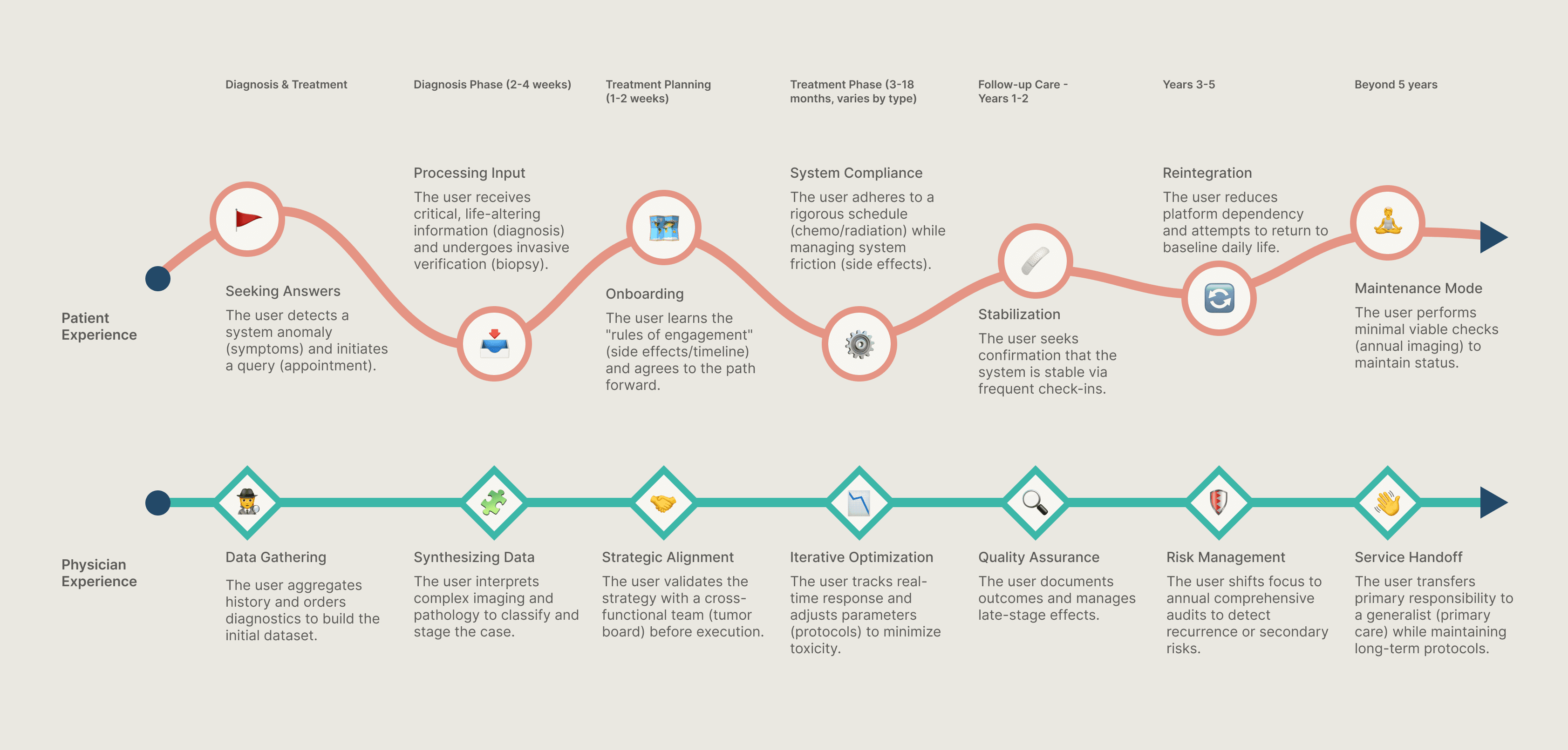
To ask the right questions, I first had to learn the language of Oncology.
I started by mapping the standard of care from diagnosis to survivorship to see exactly where the 'Patient vs. Physician' journey diverges. This deep dive exposed the critical fragmentation in current tools and pinpointed the specific moments where doctors make key clinical decisions. To make sure I wasn't guessing, I validated this entire framework with medical stakeholders before I even spoke to a user.
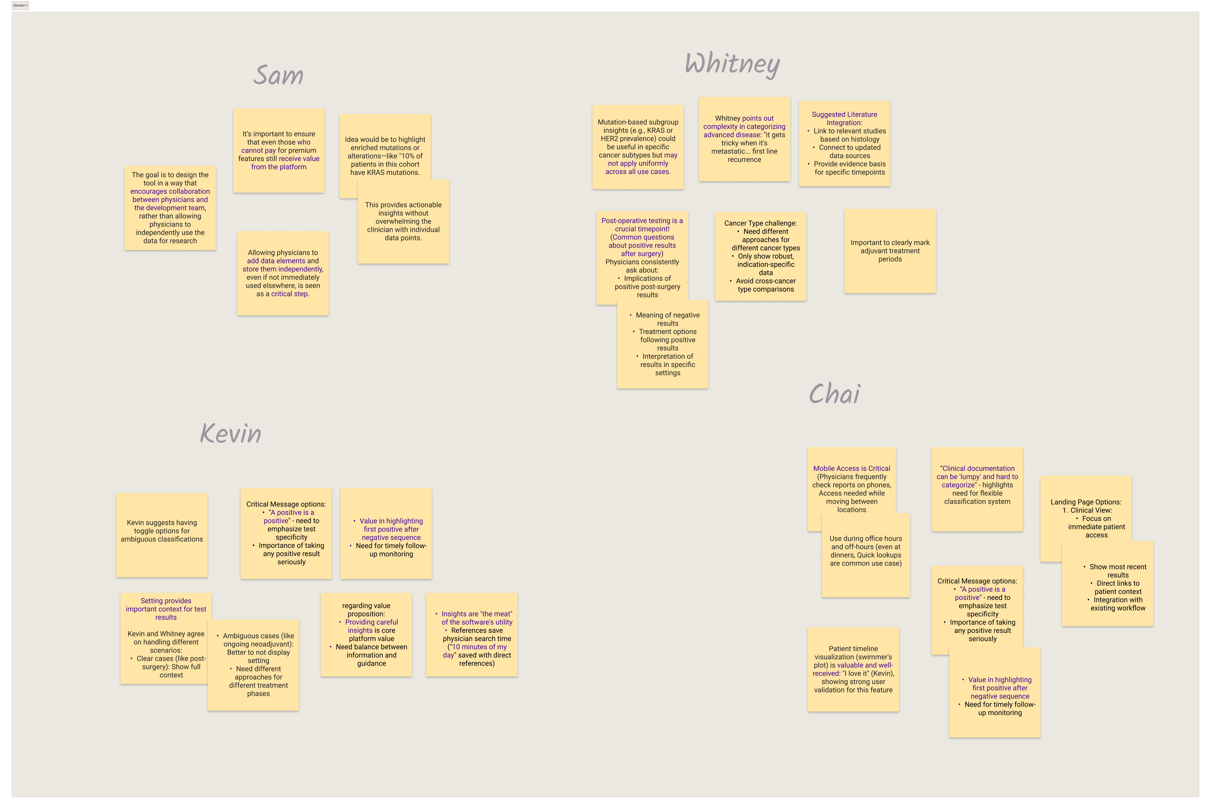
User Interviews
Validating assumptions with real physicians uncovered critical workflow patterns.
Ideation
I focused on two core workflows that would deliver the most clinical value.
Research revealed that physicians interact with patient data in two fundamentally different modes: deep-dive analysis of individual patients (during treatment decisions) and profile comparison across their practice (to compare same treatment protocol for similar patient type). I designed dedicated experiences for each, connected by a home dashboard that surfaces what matters most.
Every design decision was filtered through one question: does this help the doctor make a faster, informative and more confident clinical decision?
Initially, the tool was viewed as a data repository. Through research, we shifted the strategy to design a tool that encourages physicians review and compare data, rather than just single case view.
Design & Iteration
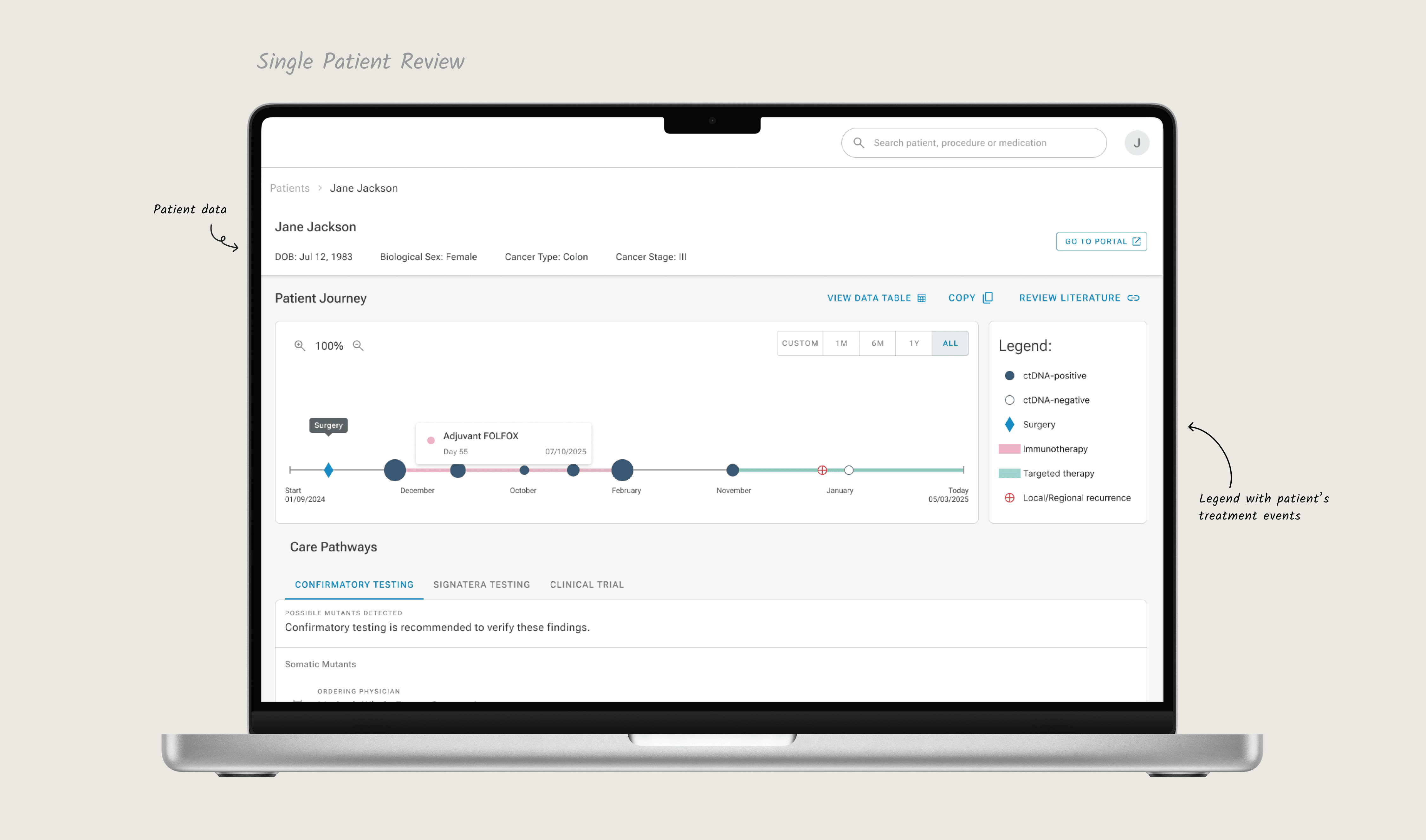
One on challenging part in the interface was visualization of the swimmer plot.
While there is a general consensus on what symbols mean in oncology, there is no international governing body that dictates a "universal legend" for swimmer plots. So I researched existing industry examples, from which I sorted the most consistent symbols and symbols that may very.
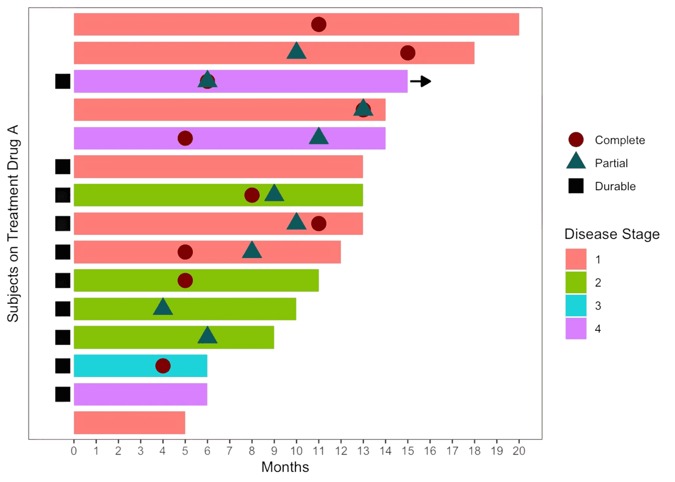
Finalized version of legent, together with few versions of progress line we turned into prototype to test with primary users. Together with medical stakeholders of the project, we reproduces specific examples of single case patient treatment that we showed to the doctors and asked them to anylise the treatment of 3 versions of interface.
Design & Iteration
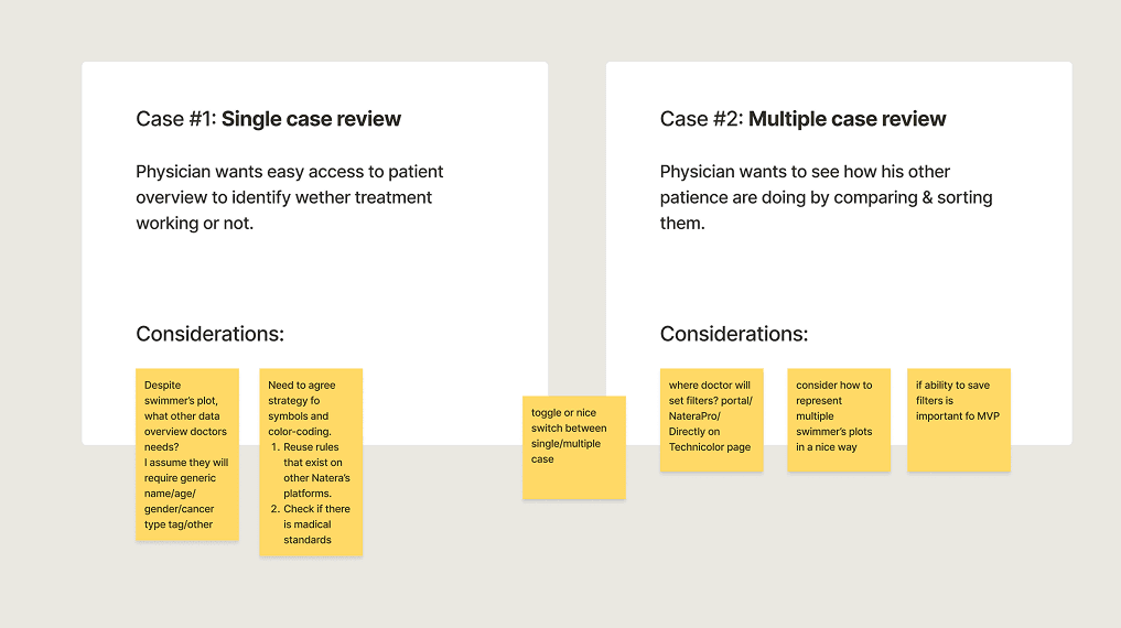
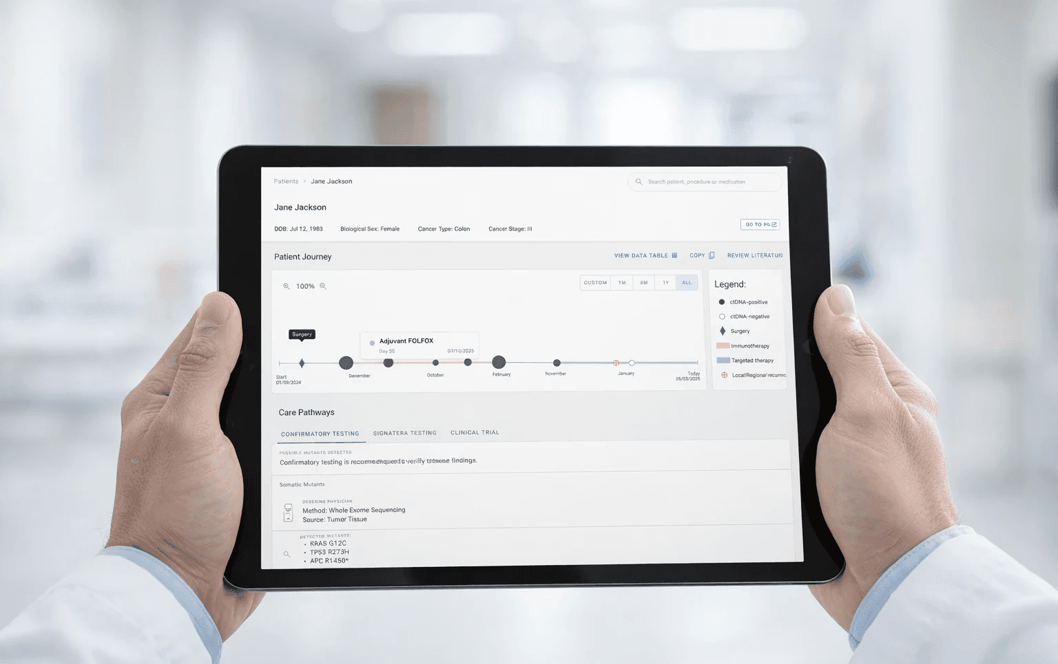
Use Case 1: Single Patient Review
The swimmer's plot visualization became the product's centerpiece. The top panel provides patient context; the main view correlates ctDNA results with treatment milestones answering the critical question:
"Is this therapy working?"
Design & Iteration
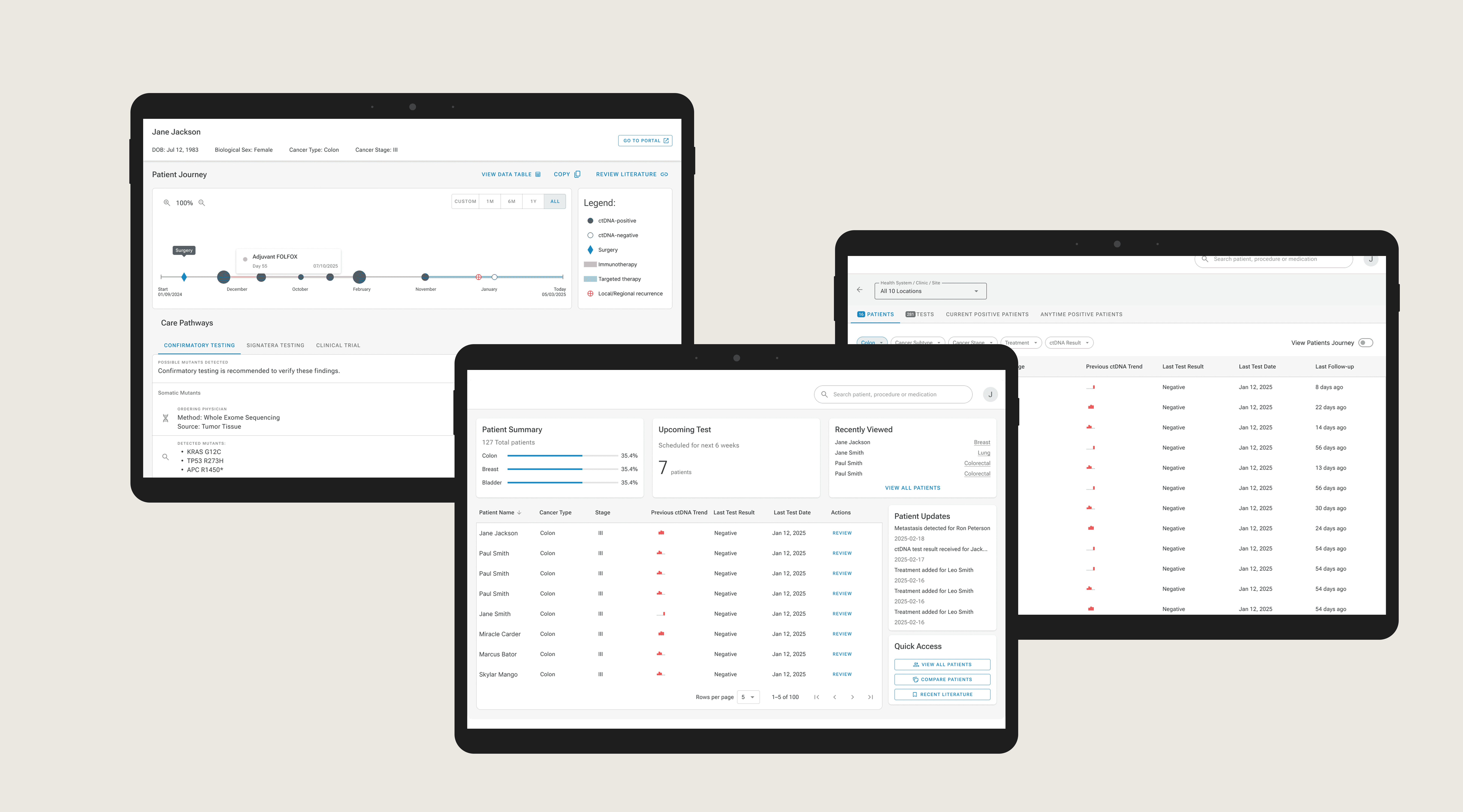
Use Case 2: Multiple case review
Physicians manage dozens of patients simultaneously, and their mental model isn't a database it's a priority list. I designed the multi-patient view around the way doctors already think: sort by the same clinical categories they use daily, filter by what needs attention now (new results, upcoming tests, high-risk flags), and quickly compare patient trajectories side by side. The goal was zero learning curve the interface should feel like an extension of their existing workflow, not another tool to learn.

Final design
The MVP successfully launched, moving from a concept to a functional clinical tool that:
- Easy log into the platform through existing solutions
- Review single patient cases to instantly identify if treatment is working .
- Visualize the full cancer journey using the interactive "Swimmer's Plot" timeline.
- Compare multiple patient cases to spot trends across the population .
- Quickly access relevant literature to support clinical decisions without leaving the app .
- Monitor patients on-the-go with a fully optimized mobile experience.

Results & Impact
0 → 1 MVP
Shipped a production-ready precision medicine platform in 6 months as the sole product designer
Physician-validated
Swimmer’s plot became the product’s core differentiator, confirmed through clinical user research
3 revenue drivers
Platform design directly addressed test utilization, payer friction, and clinical data strategy goals
Key Learnings
- Designing for both the patient and physician journey was essential, doctors don't work with data points, they work with people. Every screen had to reflect that, not just a clinical metric.
- Oncologists don't need more data they need the right data at the right moment. That single insight shaped every interaction in this product.