
Company:

Project Duration:
Project Duration:
Approximately 6 month
with pauses between projects
Approximately 6 month
with pauses between projects
Team:
Team:
Me (Product designer)
Sam H (Design manager)
Stefan A (Product designer)
Me (Product designer)
Sam H (Design manager)
Stefan A (Product designer)
Overview
This project combines several smaller initiatives focused on modernizing the existing mobile side of the platform.
Lenus eHealth is a digital health platform that empowers fitness trainers and health professionals to deliver personalized coaching through an all-in-one solution. With mobile experience becoming increasingly important, our team of three designers took on the challenge of elevating the platform's mobile presence to match its desktop capabilities.
Lenus eHealth is a digital health platform that empowers fitness trainers and health professionals to deliver personalized coaching through an all-in-one solution. With mobile experience becoming increasingly important, our team of three designers took on the challenge of elevating the platform's mobile presence to match its desktop capabilities.
Company introduction
Through an evolutionary design approach, we created a consistent, modern design system that could scale with the platform's growing feature set while maintaining the functionality that users relied on daily.
Through an evolutionary design approach, we created a consistent, modern design system that could scale with the platform's growing feature set while maintaining the functionality that users relied on daily.
Problem Statement
The mobile platform had become outdated and inconsistent due to being deprioritized over time.
The design needed modernization while maintaining functionality and introducing a cohesive design system.
The design needed modernization while maintaining functionality and introducing a cohesive design system.
User Needs
Coaches reported that the app didn't reflect the premium nature of their services and contained suboptimal UX solutions that hindered their ability to deliver high-quality coaching experiences
Clients perceived the app as dated and lacking the polish expected from a professional health platform, impacting their engagement and trust in the service.
Design Constraints
- Need to maintain compatibility with existing platform features
- Limited access to original design files (some designs only available as screenshots)
- Required incremental implementation approach to gather continuous feedback
- Complex existing feature set that needed to be preserved and enhanced
Here is how I designed it:
Here is how I designed it:
Here is how I designed it:
Here is how I designed it:
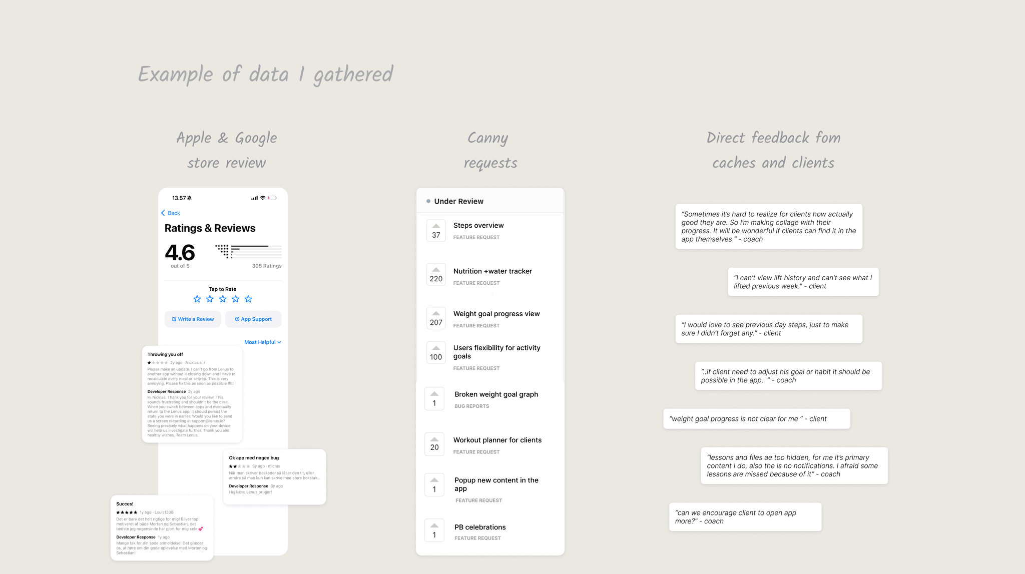
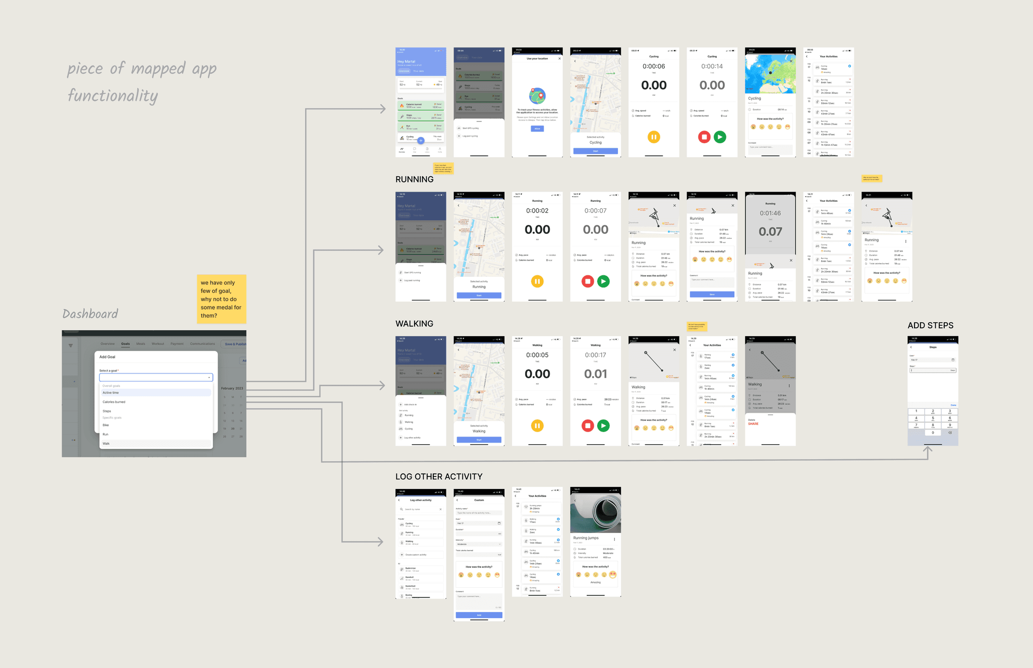
Research
A large-scale research effort was conducted which included mapping existing app flows, analyzing competitor fitness platforms, and gathering extensive user feedback.
This comprehensive approach allowed us to understand dashboard/mobile feature connections, identify navigation bottlenecks, document user flow inconsistencies, and validate our findings against both industry standards and real user needs.
This comprehensive approach allowed us to understand dashboard/mobile feature connections, identify navigation bottlenecks, document user flow inconsistencies, and validate our findings against both industry standards and real user needs.
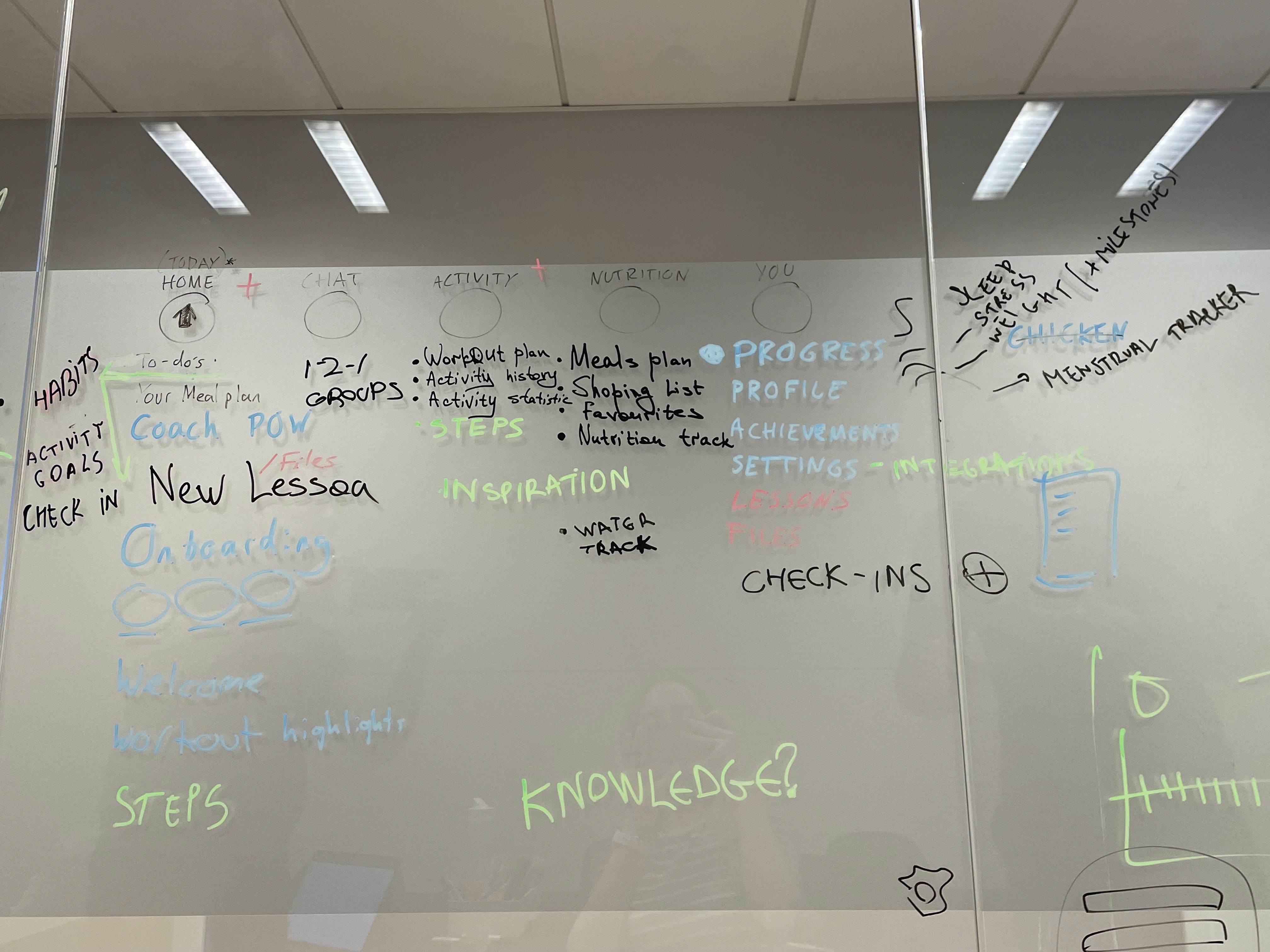
Ideation
We organized focused brainstorming sessions to establish a clear direction for the redesign.
During these collaborative meetings, we systematically questioned our existing solutions by evaluating them against established UX standards and industry best practices. The discussions helped us shape a compelling vision for the app's navigation patterns and interaction models. Through these sessions, we also established clear design priorities that would guide our decision-making throughout the project.
During these collaborative meetings, we systematically questioned our existing solutions by evaluating them against established UX standards and industry best practices. The discussions helped us shape a compelling vision for the app's navigation patterns and interaction models. Through these sessions, we also established clear design priorities that would guide our decision-making throughout the project.
Design Strategy
We agreed on evolutionary redesign approach rather than pursuing a complete overhaul, which allowed us to maintain platform stability.
Each feature redesign began with the analysis of existing design patterns, specific user pain points and previously gathered data. That helped to identify areas of improvement.
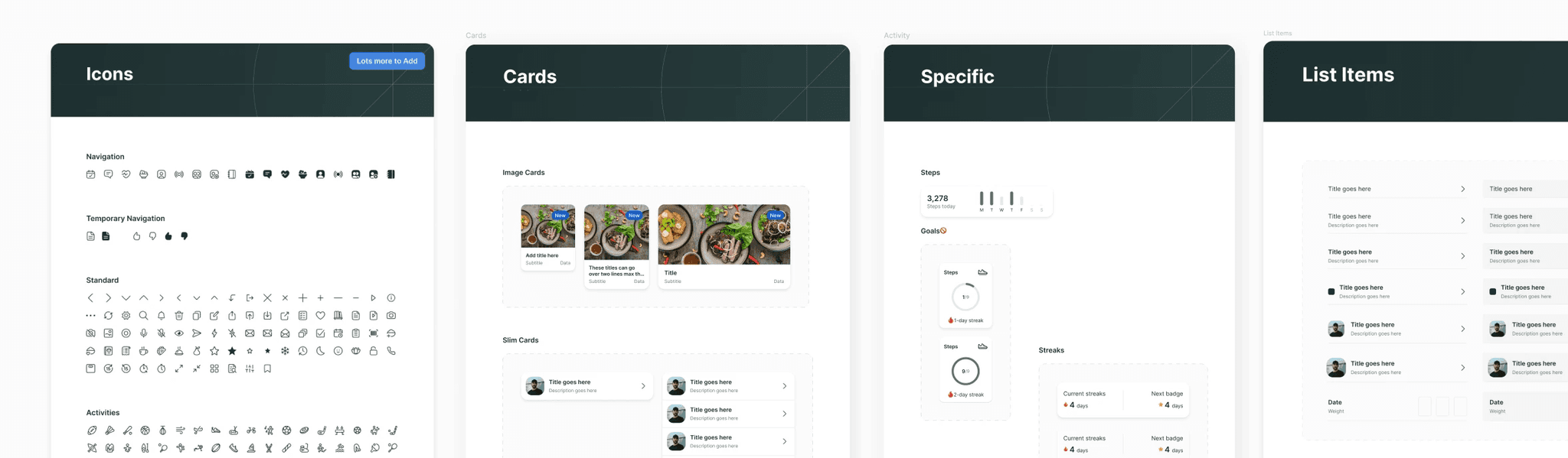
New design system development followed atomic design principles, starting with foundational elements like color palettes and typography. These were then combined into more complex components to create consistent patterns across the platform.
Finally, we implemented the redesign page by page, allowing for immediate feedback collection and quick iterations. This approach helped us to iterate each decision very quickly and be flexible.
Each feature redesign began with the analysis of existing design patterns, specific user pain points and previously gathered data. That helped to identify areas of improvement.
New design system development followed atomic design principles, starting with foundational elements like color palettes and typography. These were then combined into more complex components to create consistent patterns across the platform.
Finally, we implemented the redesign page by page, allowing for immediate feedback collection and quick iterations. This approach helped us to iterate each decision very quickly and be flexible.
Final design
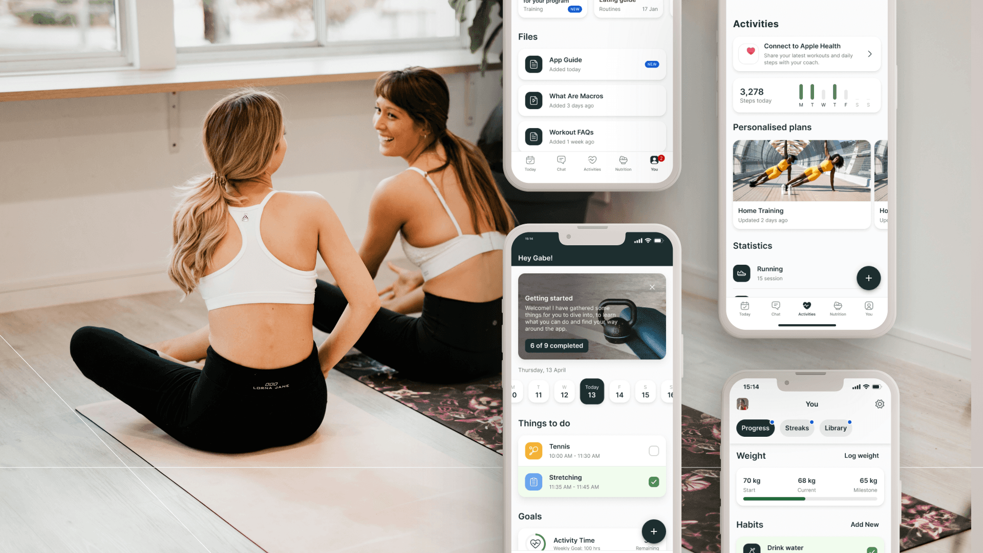
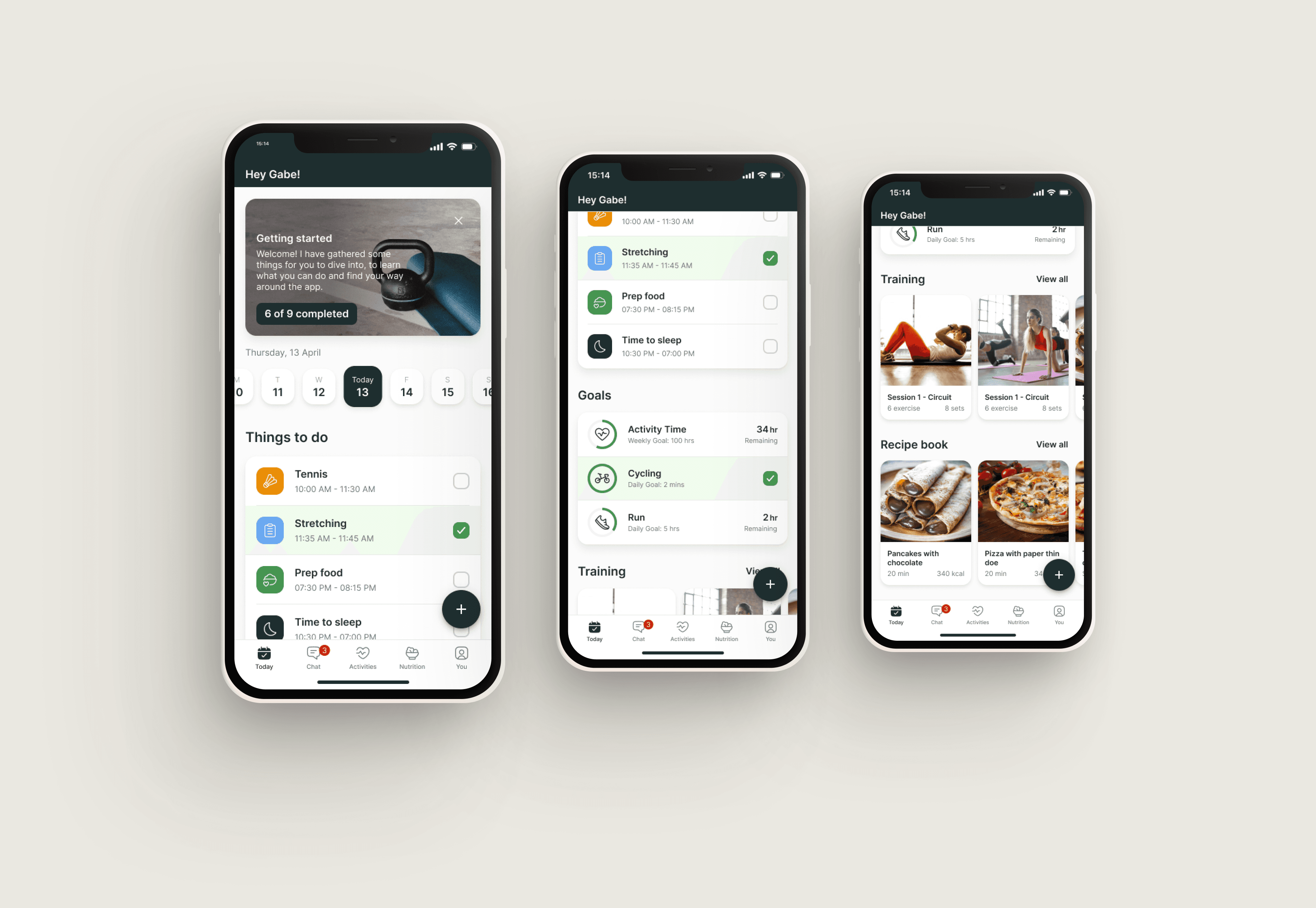
As a result, I redesigned several main mobile areas:
- Today page
- Activity page
- You page
- Today page
- Activity page
- You page
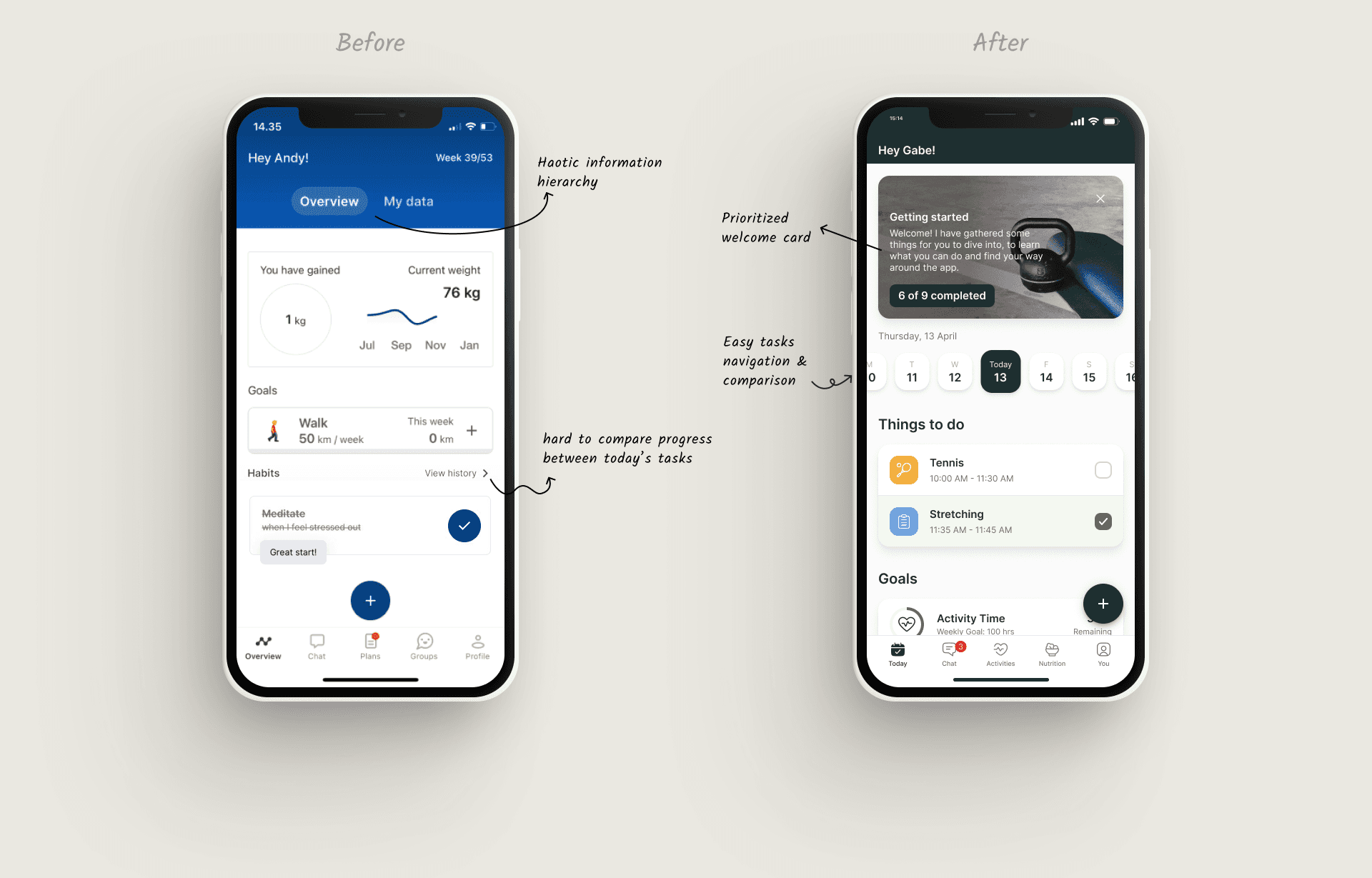
Today page
The daily overview page was reimagined to increase user engagement. Based on product vision and user feedbacks, it was transformed into a well-organized fitness routine summary. Users can easily access urgent actions, track custom goals and habits, and receive important reminders and new content from their coach.
The daily overview page was reimagined to increase user engagement. Based on product vision and user feedbacks, it was transformed into a well-organized fitness routine summary. Users can easily access urgent actions, track custom goals and habits, and receive important reminders and new content from their coach.
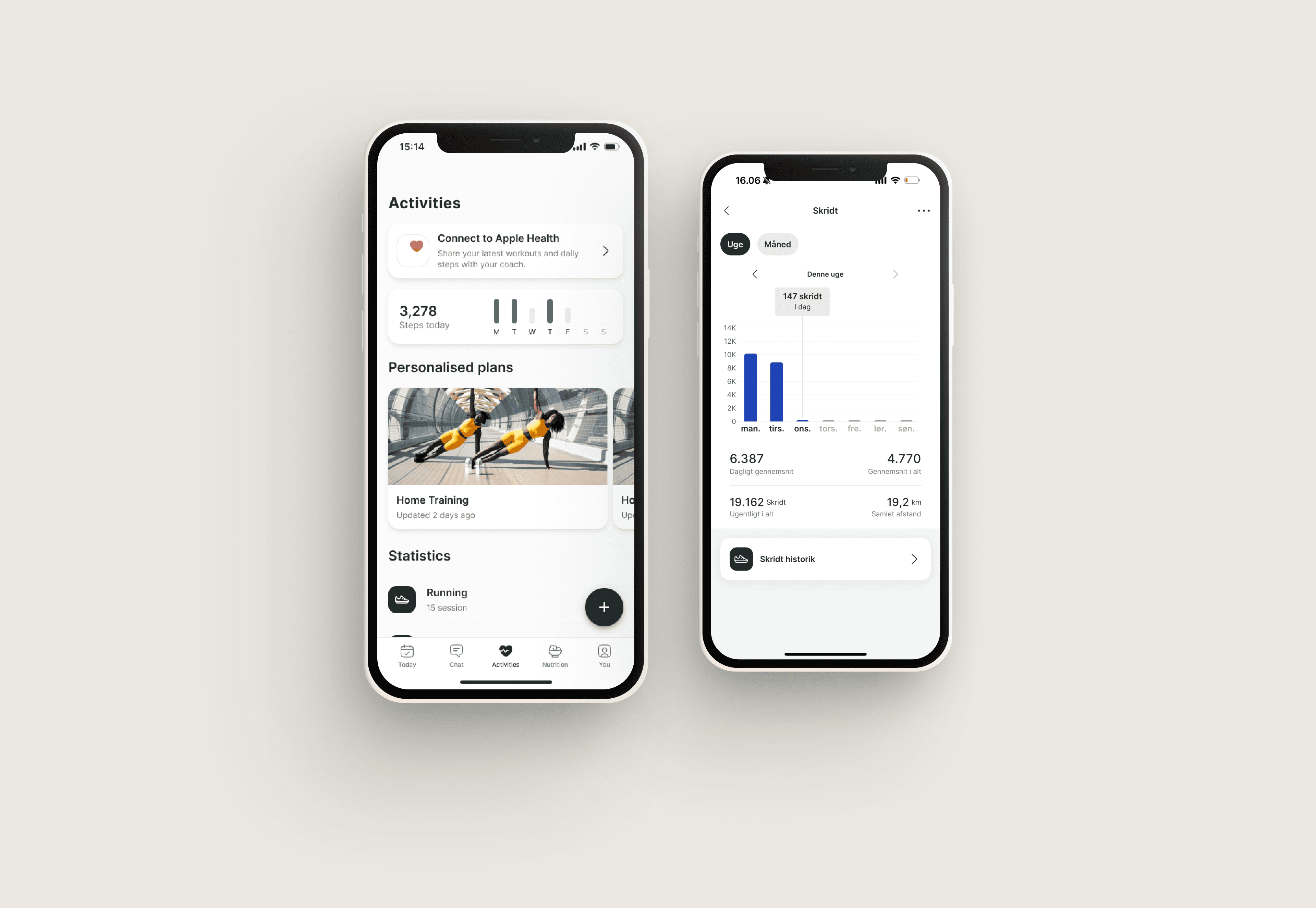
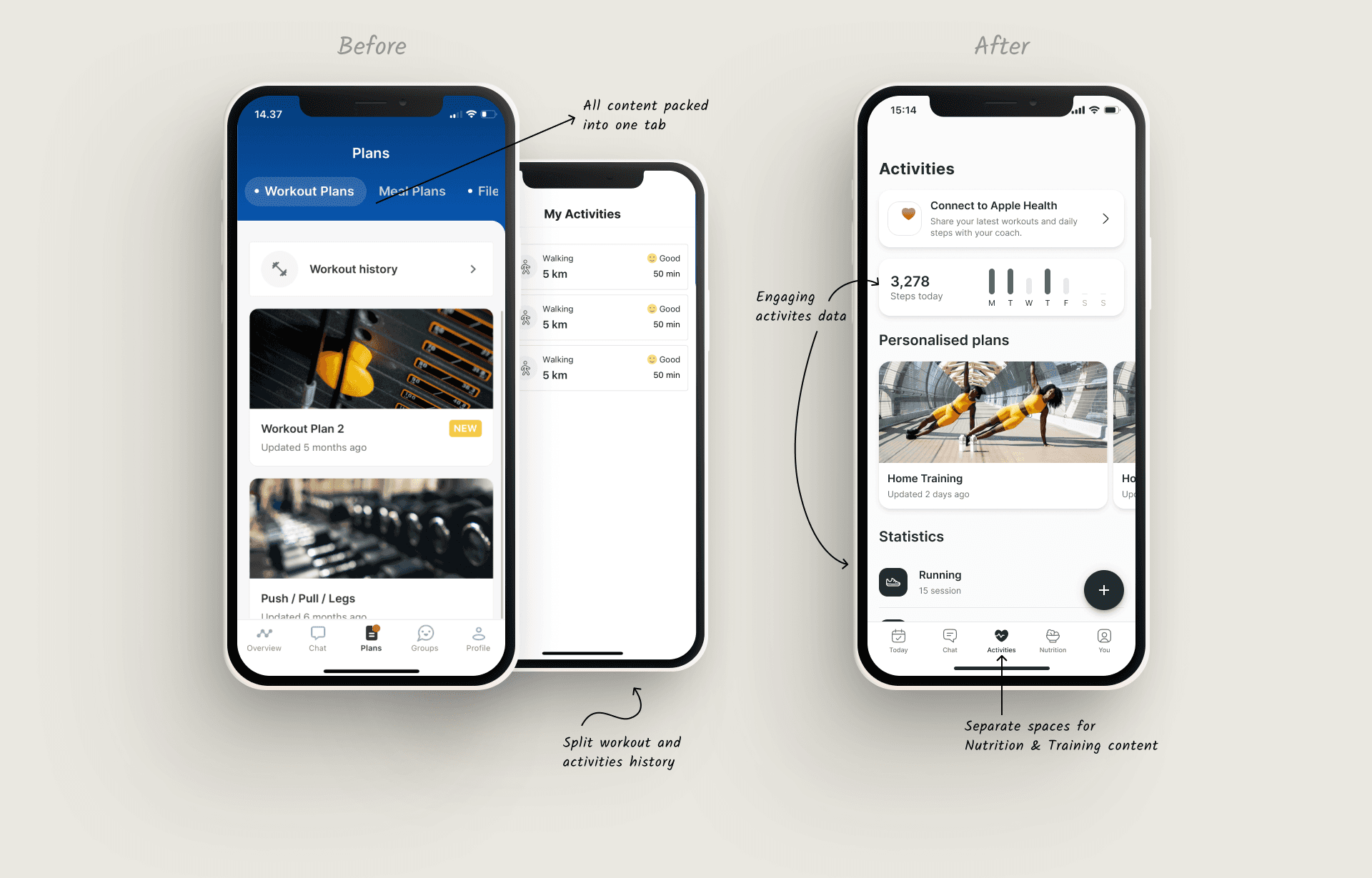
Activity page
The redesigned Activity page emphasizes the user's training experience. It provides a clear overview of progress and performance metrics, allowing users to track their fitness activities and celebrate achievements. The hierarchy and widgets were designed based on qualitative and quantitative findings. New design led to increased usage of the workout tracking functionality.
The redesigned Activity page emphasizes the user's training experience. It provides a clear overview of progress and performance metrics, allowing users to track their fitness activities and celebrate achievements. The hierarchy and widgets were designed based on qualitative and quantitative findings. New design led to increased usage of the workout tracking functionality.
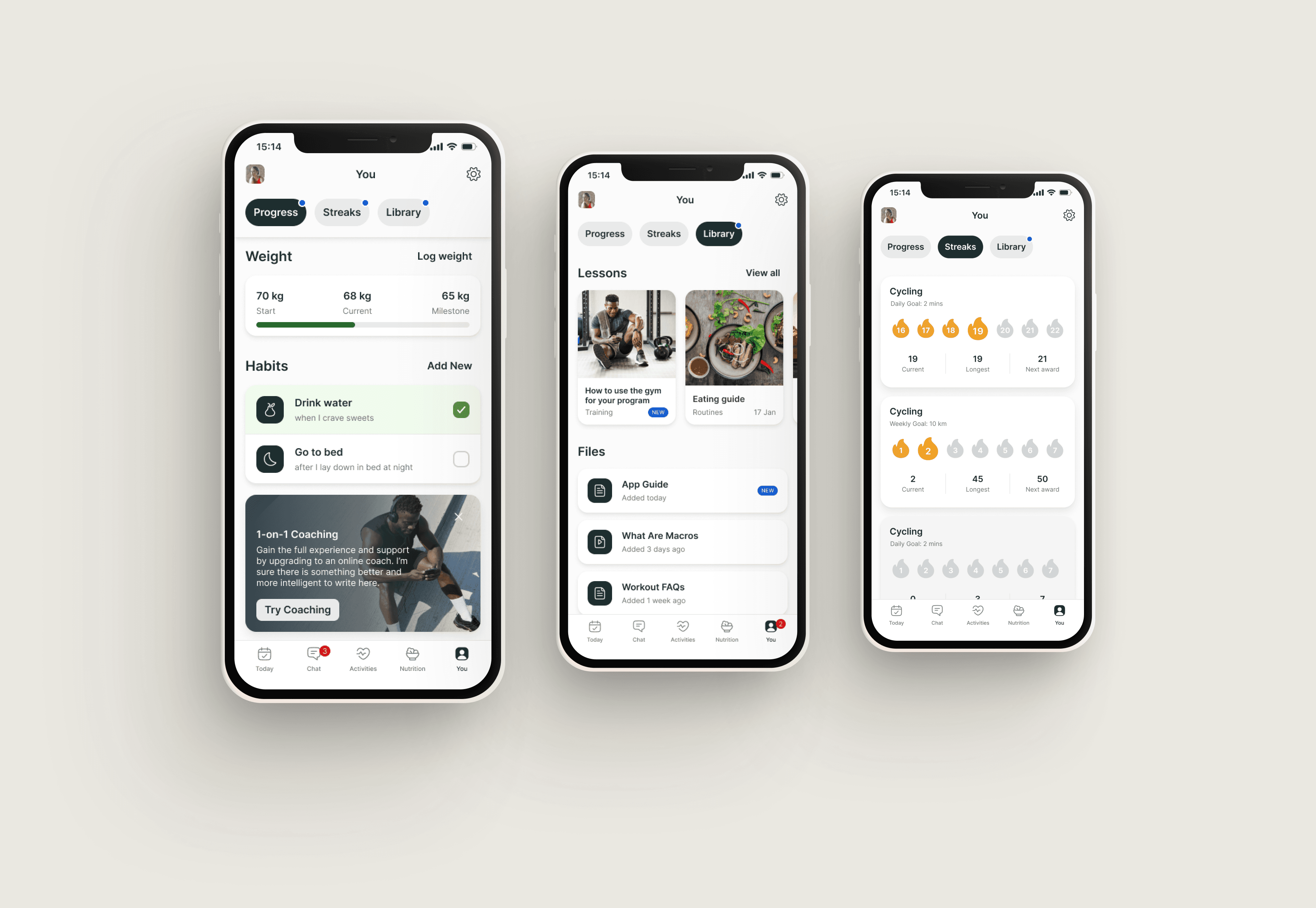
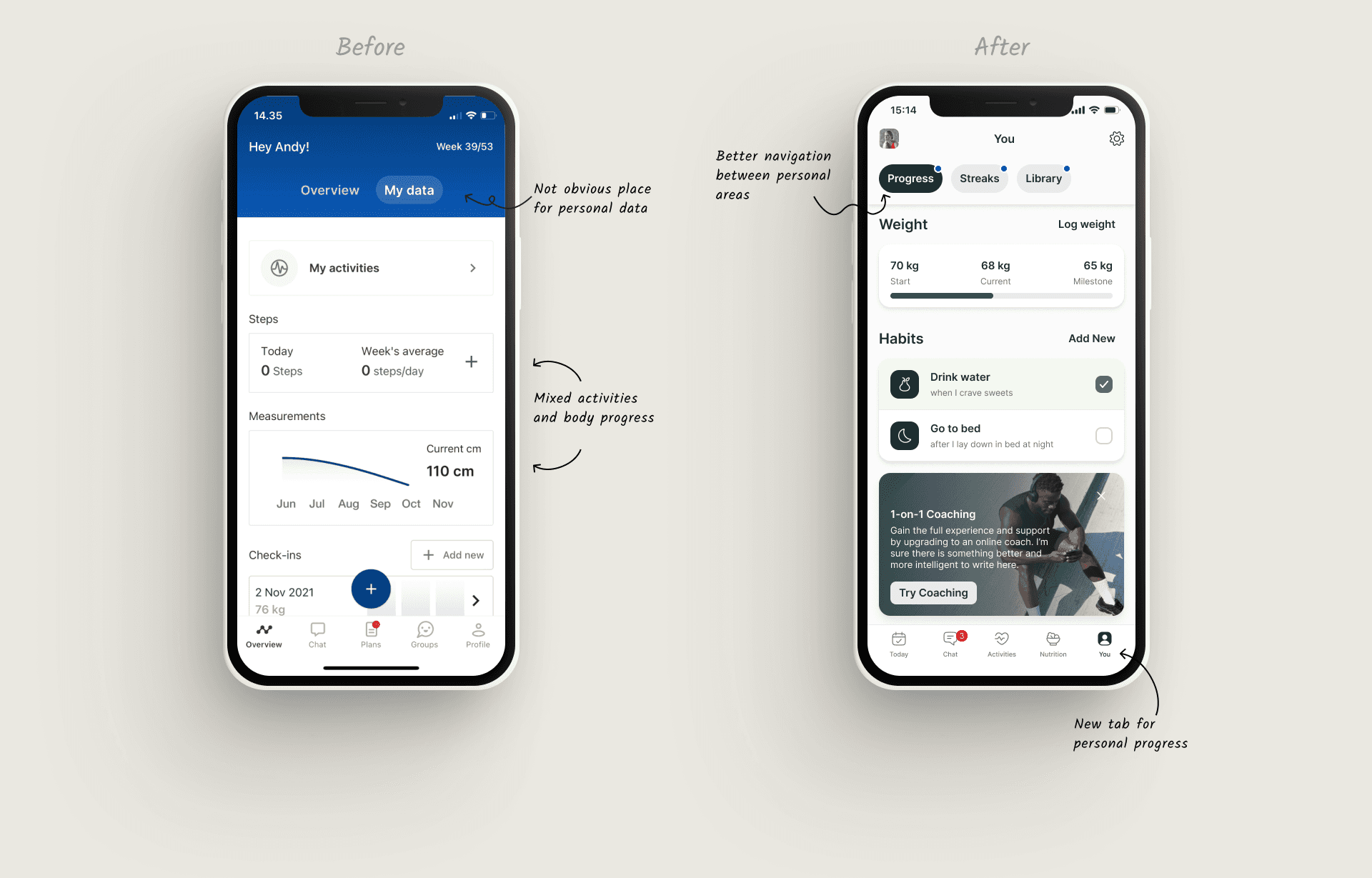
You page
The "You" page consolidates all relevant personal progress features into a centralized hub. This allows users to easily access and monitor their personal progress in one convenient location. Also, redesign helps users better associate themselves with the product and its broad functionality.
The "You" page consolidates all relevant personal progress features into a centralized hub. This allows users to easily access and monitor their personal progress in one convenient location. Also, redesign helps users better associate themselves with the product and its broad functionality.
Outcome
The redesign delivered significant immediate & long term benefits across multiple areas of the platform.
User experience saw notable improvements through more intuitive navigation, consistent interaction patterns, and increased visual harmony.
Our new design system dramatically improved design efficiency by reducing design debt and making faster feature designing through a comprehensive component library.
From a business perspective, we observed increased user engagement metrics, higher coach satisfaction rates, and an overall improvement in platform perception.
The improved collaboration between design and development teams, with faster both designing and developing, which sped up product development.
Leanings
An evolutionary approach proved effective, as small, iterative changes allowed us to maintain platform stability, gather feedback and adjust as needed. Additionally, investing in a well-built design system reduced inconsistencies, improved development speed, and improved overall quality.
An evolutionary approach proved effective, as small, iterative changes allowed us to maintain platform stability, gather feedback and adjust as needed. Additionally, investing in a well-built design system reduced inconsistencies, improved development speed, and improved overall quality.
Connect to Content
Add layers or components to infinitely loop on your page.
Connect to Content
Add layers or components to infinitely loop on your page.
Connect to Content
Add layers or components to infinitely loop on your page.
Ready to create something amazing together? Let’s connect!
marta.ux © 2024
Connect to Content
Add layers or components to infinitely loop on your page.
Connect to Content
Add layers or components to infinitely loop on your page.
Connect to Content
Add layers or components to infinitely loop on your page.
Ready to create something amazing together? Let’s connect!
marta.ux © 2024
Connect to Content
Add layers or components to infinitely loop on your page.
Connect to Content
Add layers or components to infinitely loop on your page.
Ready to create something amazing together? Let’s connect!
marta.ux © 2024